I Tried TikTok’s New Instagram Competitor: Here's Why It's Painfully Mediocre

TKFFF · 2024-06-25 14:58
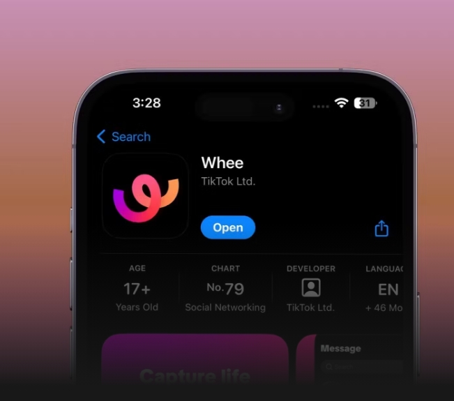 ByteDance, the parent company of TikTok, quietly launched Whee, a competitor to Instagram, in June 2024. Despite its promising features, the app is currently underwhelming. Here's why.
What Is Whee?
Remember when Meta launched Instagram Stories and Reels, attempting to compete with TikTok and Snapchat? Well, ByteDance decided to follow in Meta's footsteps and launched an Instagram-like app, Whee, allowing users to share images with their closest friends. This isn't a first though—TikTok has tried competing with Instagram before. In 2020, ByteDance launched Lemon8, a photo and video-sharing platform. On the 17th of April 2024, TikTok also began rolling out TikTok Notes in Australia and Canada. According to a post on X, TikTok Notes is supposed to be "a dedicated space for photo and text content".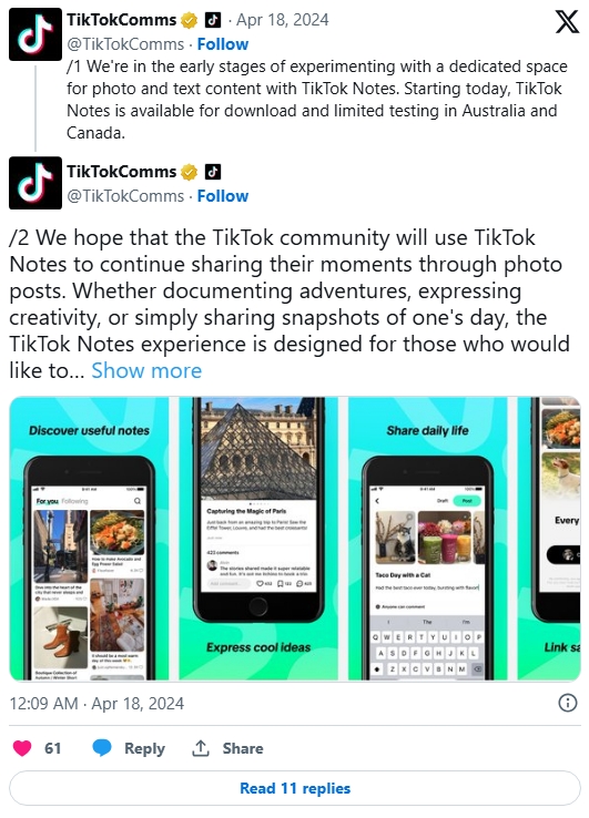 It's unclear how TikTok plans on keeping Whee and TikTok Notes distinct, since both allow users to share images with their followers. Whee is available on the App Store and Google Play Store, and has already racked up over a thousand downloads. While the app is currently available in a few countries only, I downloaded the app and tested it out extensively.
Why Whee Is Promising
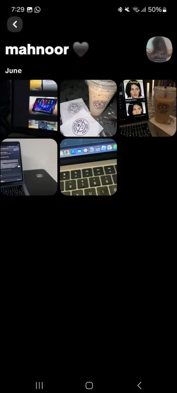
Think of Whee as a more personal version of Instagram. Unlike Instagram and most other social networking apps, Whee doesn't offer the option to have a public account. Once you log into the app, your account will automatically be set to private, and you can only view posts your friends share. Ultimately, this means that you can't view someone's posts unless they accept your follow request. So, while this does imply that viewing an influencer or celebrity's posts on Whee is out of the question, I do think we have enough platforms for this. Whee is a platform made for you to share pictures with only your closest friends and family. You have the option to share posts with your friends on Whee or set them to "Only you."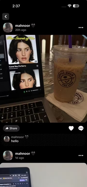 One feature I loved about Whee is how it displays all your posts. Unlike other social networking apps, Whee displays all your images in a grid form, grouped by months. This layout does seem quite similar to Snapchat's Gallery. For instance, as shown in the image below, everything I've posted in the month of June is shown under the June category.
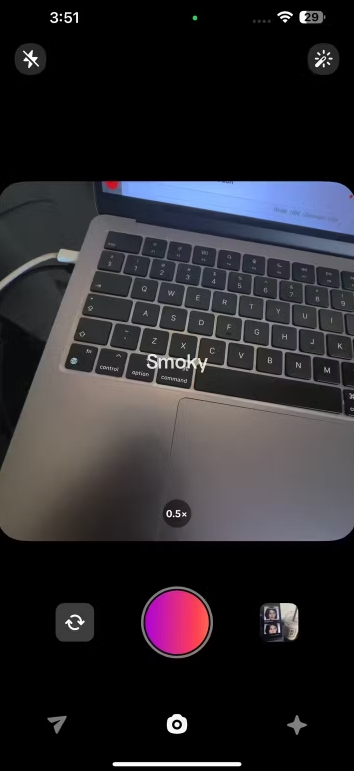
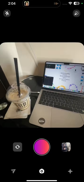 On the homepage, you'll be able to see three different tabs—messages, camera, and feed. At first glance, I thought the app's interface was incredibly similar to BeReal (especially the camera).
In the Whee app, you can choose from 0.5x, 1x, 2x, and 3x zoom options. By swiping, you can select filters including Emotive, Light Retro, CCD Style, Smoky, Lo-fi, Camping, and Vintage. There's also a Beauty filter option available.
 When I tap an image on my profile, I can see any comments my friends have left on my posts and share it to other platforms.
文章来源: 文章该内容为作者观点,TKFFF仅提供信息存储空间服务,不代表TKFFF的观点或立场。版权归原作者所有,未经允许不得转载。对于因本网站图片、内容所引起的纠纷、损失等,TKFFF均不承担侵权行为的连带责任。如发现本站文章存在版权问题,请联系:1280199022@qq.com
分享给好友:

 While Whee is yet to be released worldwide, it has already faced significant backlash due to this decision. Recently, many people have deleted their TikTok accounts, whether due to taking a break from social media or simply because they are no longer interested in using TikTok. Consequently, these individuals cannot use Whee without creating a new TikTok account, which is far from ideal.
Another minor point I noticed while logging into Whee account is that I couldn't create an account without setting a profile picture. Currently, you also can't add captions to your Whee posts, and you're restricted to sharing images only. This means you can't share aesthetically pleasing videos you took with your friends on Whee. You also can't see the number of followers someone else has or how many people they follow.
I tested the app out with a group of friends, who have a mix of Android and iPhone devices. Unfortunately, there are currently a few technical issues. I noticed that iPhone users could post images but couldn't see what others posted. If they attempted to open someone's Whee account, it would simply display "Their posts will show up here".
No matter how many times they would refresh, the same thing would happen. Conversely, Android users could both check out friends' posts and share their own pictures. Below, I've attached two screenshots—one of my profile on my friend's Android device, and another of the same profile on another friend's iPhone. Both the screenshots were taken after I posted several images on my Whee account.
 So, if you are an iPhone user currently and are hoping to use the app with a group of friends, you may be setting yourself up for disappointment.
However, considering how new the app is, technical difficulties don't come as a surprise, and we do expect ByteDance to address them promptly. If you are looking for an app that offers a more intimate experience than Instagram offers, I personally think Whee is something you would enjoy.
However, it's worth mentioning that Instagram has also been ramping up its efforts to create a safer environment for users and their close friends. Towards the end of 2023, Instagram introduced a feature that allows users to share posts exclusively with their close friends. Recently, it also rolled out a feature enabling users to go live with only their close friends as the audience.
The Whee app is nowhere near perfect yet, and I can't say it's an app I'd use every day given its current set of features. However, I can picture myself using the app more often once more features are made available.


